
Focus · Attention & wellbeing · Concept
Hold the boundaries you set. Don’t guess at intentions.
A distraction-to-intention app that protects what you picked up your phone to do, instead of guessing what you meant.
Designer · Independent concept project
Research, product strategy, interaction design and prototyping

ROLE
Research, strategy, interaction design, prototyping

TYPE
Independent concept project

TOOLS
Figma, HTML prototype

CONTEXT
Interaction Design Foundation
Where it started
I picked up my phone to sketch an idea. Twenty minutes later, I hadn’t.
I unlocked my phone to check one message before sketching a design concept. On the way, a stack of LinkedIn, Instagram and Facebook notifications pulled me somewhere else entirely.
Nothing was wrong with my intention. The problem was everything standing between unlocking the phone and doing the thing I picked it up for.
The moment worth designing for
The few seconds after unlock, when intention is still intact and the notification stack is already competing for it.
The problem
The apps competing for attention have no reason to give it back
01
Hijacked, not undisciplined
People usually open their phone with a clear purpose. Notification stacks interrupt it before it’s finished.
02
Blocking creates rebellion
Hard blockers treat the user as the problem. They get bypassed or deleted once frustration outweighs the goal.
03
Nudges fade
A common complaint in low reviews of focus apps: they work for a week and become invisible by week three.
The design question
How might we protect what someone meant to do, without the app pretending to know what that is?
The pivot
I disagreed with the AI’s first answer, and the product changed shape
AI’S FIRST DRAFT
Intention detection
The system would infer what you meant to do, resurface abandoned hobbies, and redirect you when you drifted.
Why I rejected it: inferring intent was too fragile to trust. I’d rather the system hold a rule I set than guess at one.
MY MODEL
Time-based boundaries
The user defines the rules: when focus time is, which apps matter, who can always reach them. The system only holds those rules.
The principle: hold the boundaries the user sets. Don’t infer intentions.
Who it’s for
Three schedules broke the idea of a single setup
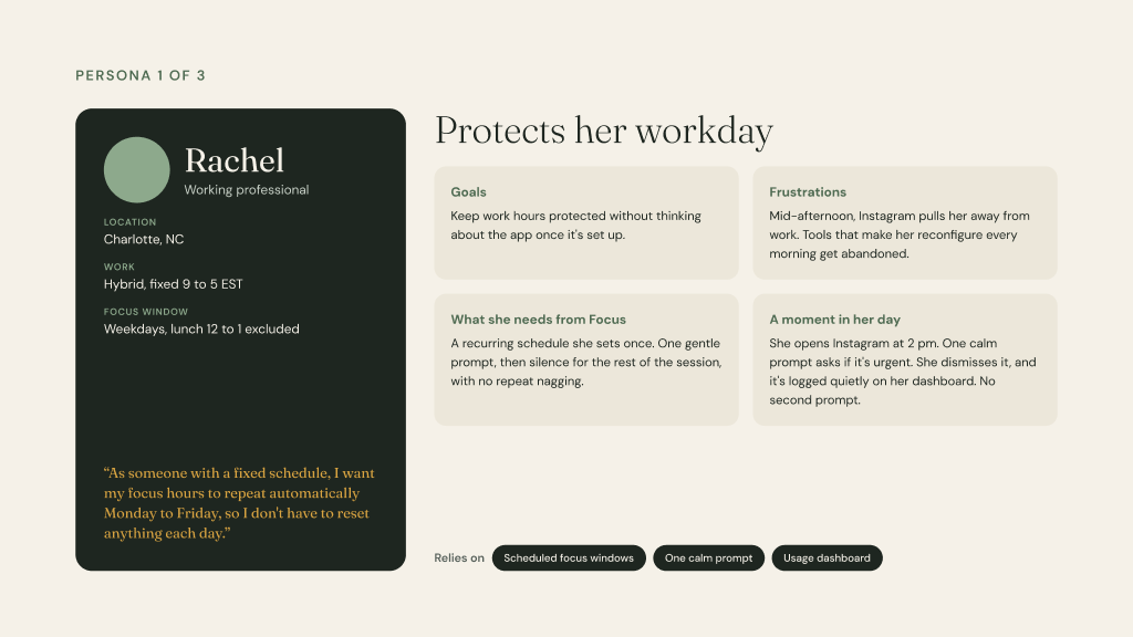
Rachel
Working professional
Set focus hours once and have them repeat. No daily reconfiguring.
Scheduled windows · One calm prompt · Dashboard
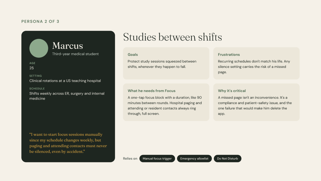
Marcus
Third-year medical student on rotations
One-tap focus. Hospital pages must always get through: a patient-safety requirement, not a preference.
Manual trigger · Emergency allowlist · Do Not Disturb
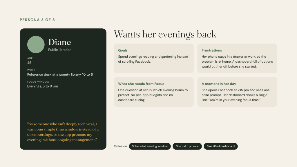
Diane
Public librarian, less tech-fluent
One question at setup: which evening hours to protect. No settings to manage.
Evening window · One calm prompt · Simple dashboard
Competitive landscape
Three kinds of help, and the gap none of them cover
Hard blockers
Opal · Freedom · Forest
Lock apps or reward staying away. Effective in the moment, but bypassed, and users resent being policed.
Mindful friction
One Sec · ScreenZen · Intently
A pause before a distracting app opens. Closest to my calm prompt, with the same risk: habituation within weeks.
Platform-native nudges
Instagram’s night-time reminder
Proves a soft, dismissible prompt works at scale. But the platform has little reason to make it stick.
THE GAP
No major competitor offers selective notification surfacing on unlock, or a manual focus trigger for people without a fixed routine.
The solution
Seven features, each traced to a real need
01
Scheduled focus windows
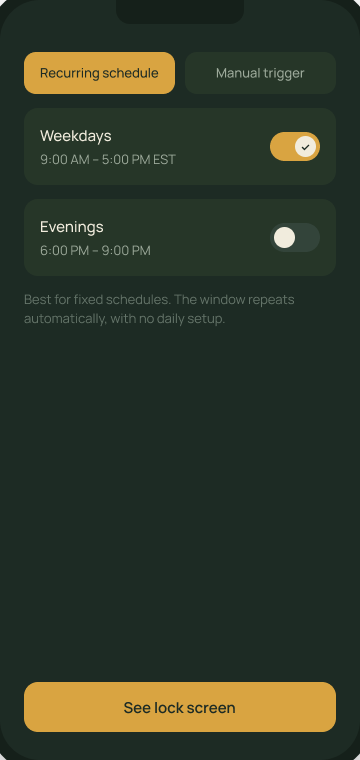
Set once, repeats automatically. For Rachel and Diane.
02
Manual focus trigger
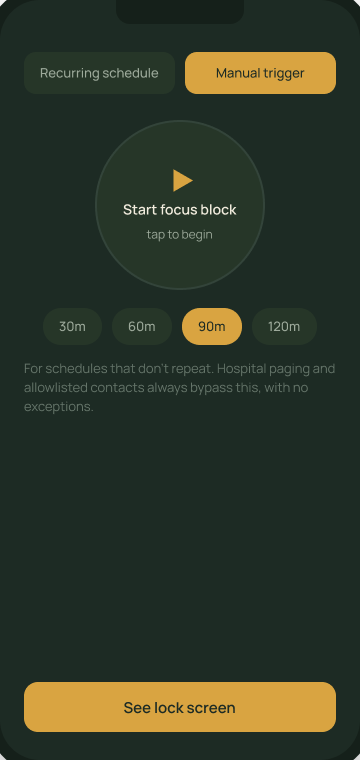
One tap and a duration, for days with no routine. For Marcus.
03
Daily time budgets per app
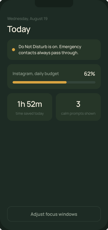
A target the user sets, not a limit the app imposes.
04
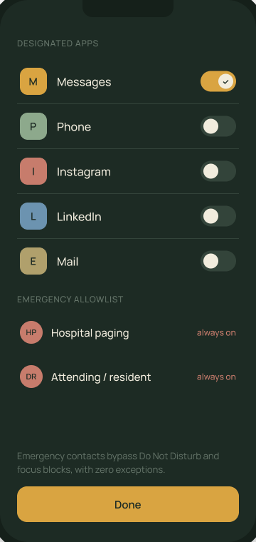
Do Not Disturb + emergency allowlist
Chosen contacts always ring through, with no prompt. For Marcus.
05
Passive usage dashboard
Usage against the user’s own target, with no shame framing.
06
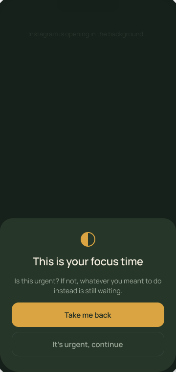
One calm prompt
Appears once if a distracting app opens during focus. Never repeated.
07
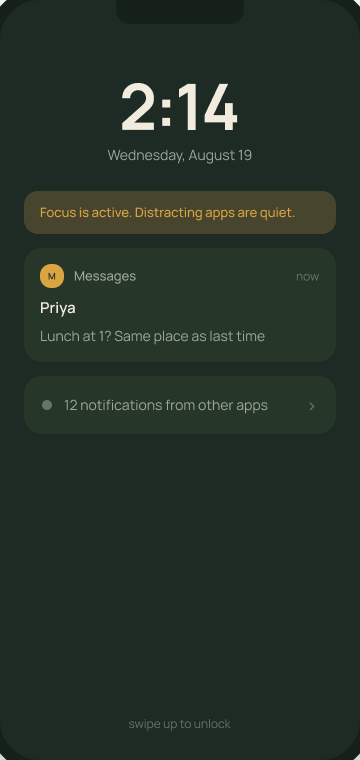
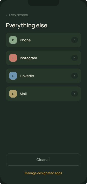
Selective surfacing on unlock
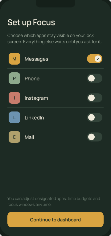
Chosen apps show in full; everything else collapses to one quiet line.
Features 06 and 07 are the new ground: the calm prompt and selective surfacing.
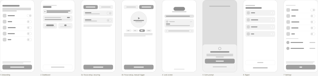
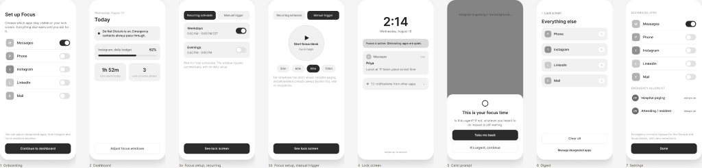
From low to high fidelity
Eight states, four passes
Layout first, then real copy in grayscale, then the moss-and-amber system in dark and light mode.
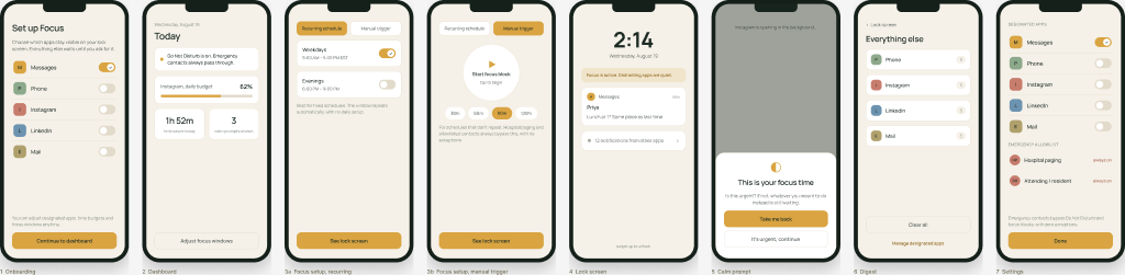
Prototype · dark mode
A fully wired seven-screen prototype
Every screen shares live state: changing a setting changes what the lock screen shows. Built in HTML, then rebuilt in Claude Design.
AI in my process
AI handed me a tracing book, not a finished drawing
WHAT AI GAVE ME
The outline: seven screens, their basic elements and the rough sequence of the flow. Fast, and useful as structure.
WHAT I FILLED IN
The character: the moss-and-amber palette, the serif and sans pairing, the calm prompt’s quiet tone, cross-screen state logic, and accessibility fixes AI never flagged, such as relying on color alone for toggle state.
“The outline told me where a notification card should sit. It had no opinion on whether the app should feel clinical or calm.”
Reflection & next steps
What I learned, and what I’d test next
WHAT I CARRY FORWARD

Specific real-world context was a bigger lever than prompting technique. “Third-year med student on rotations, hospital paging” produced a requirement I wouldn’t have designed for otherwise.
AI was useful for fast first drafts once given sharp constraints, but never caught its own generic assumptions until a real scenario pushed back.
WHAT I’D VALIDATE NEXT

Habituation: does the calm prompt still work in week three, or do people tap through it on autopilot?
The gap: is selective surfacing a real opportunity, or a sign nobody needs it? Only user testing can tell.
Micro-interactions that make people want to return, not just tolerate the app.
Independent concept project, created in the context of the Interaction Design Foundation. Not yet user-tested; next steps above describe how I would validate it.
MORE PROJECTS
All work